About the project
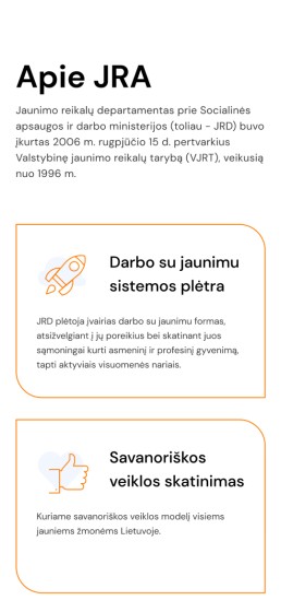
The Agency of Youth Affairs is a public non-profit institution established by the Department of Youth Affairs under the Ministry of Social Security and Labor. It focuses on developing various forms of work for youth, as well as models of volunteering, and supports youth and youth organizations.
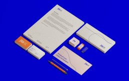
The logo
The JRA logo is typographic and consists of two parts: a three-letter abbreviation and an organization name in a smaller font on the right. The composition of three letters comes together into a single line and creates a sense of unification, which symbolizes the united youth. The round and light shapes of the logo give an impression of simplicity and effectively streamlines the name of the organization. Excellent readability and simple shapes allow the logo mark to be easy to remember.
Colors
The two-color palette was used to distinguish two versions of the website: light pink and accent blue for the youth page and light blue and accent orange for adults working with youth.
Main Pink
#FFEBEC
Accent Blue
#0500E0
Main Blue
#EBF3FF
Accent Orange
#FF7B00
Black
#171717
Gray
#F4F4F4

Typography
To create a readable, usable, and user-friendly interface and experience, we chose a typeface that consists of Bold and minimal DM Sans fonts.

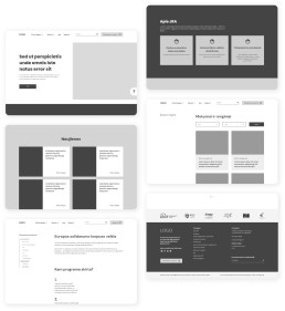
Creating wireframe
Our main task was to merge two websites (jrd.lt & jtba.lt) into one – “jra.lt” and separate the content for youth and for adults working with youth. Undoubtedly, it was essential for us to create the wireframes, which would help to build the information architecture in a much clearer and more consistent manner. Hence, we focused on distinguishing categories and subcategories, as well as overall information representation so that to make both website versions more user-friendly.
UI elements
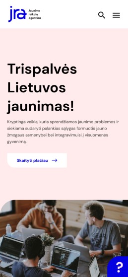
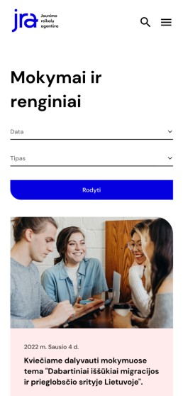
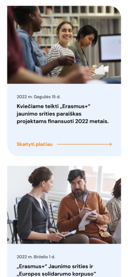
As regards UI design, we chose bold fonts, bright colors, icons, and photographs to make the website more attractive to the target audience. We also placed the most up-to-date information in colorful blocks with eye-catching icons and photographs for better scannability.
Primary buttons


.


Inverted primary buttons


.


Final Design
The final website has two versions, which are dedicated to the different target groups: youth and adults working with youth. A button on the right corner in the navigation menu was added to switch between these two versions. Thus, users from both groups can easily access the information that’s relevant to them only without getting confused.
As regards UI design, we chose bold fonts, bright colors, icons, and photos to make the website more attractive to the target audience. We also placed the most up-to-date information in colorful blocks with eye-catching icons and photos for better scannability.
Problem
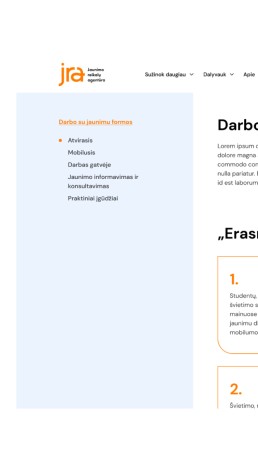
The older version of the JRA webpage had extensive dropdown menus, with the category list often reaching the bottom of the page. The way categories were organized also made it difficult and confusing for the user to find the necessary information right away and navigate through the website. Resultantly, the search for specific information was time-consuming and sometimes even fruitless, often leaving the user frustrated.
Solution
Instead of many dropdowns, we made a few mega menus, so that the user can see all categories at once and easily find the right one. What is more, when a user opens the page, s/he can always see a smaller menu with similar themes on the left side of the page. Thus, the user can quickly go to the related page without having to open the navigation menu repeatedly.
Responsive design
Mobile version
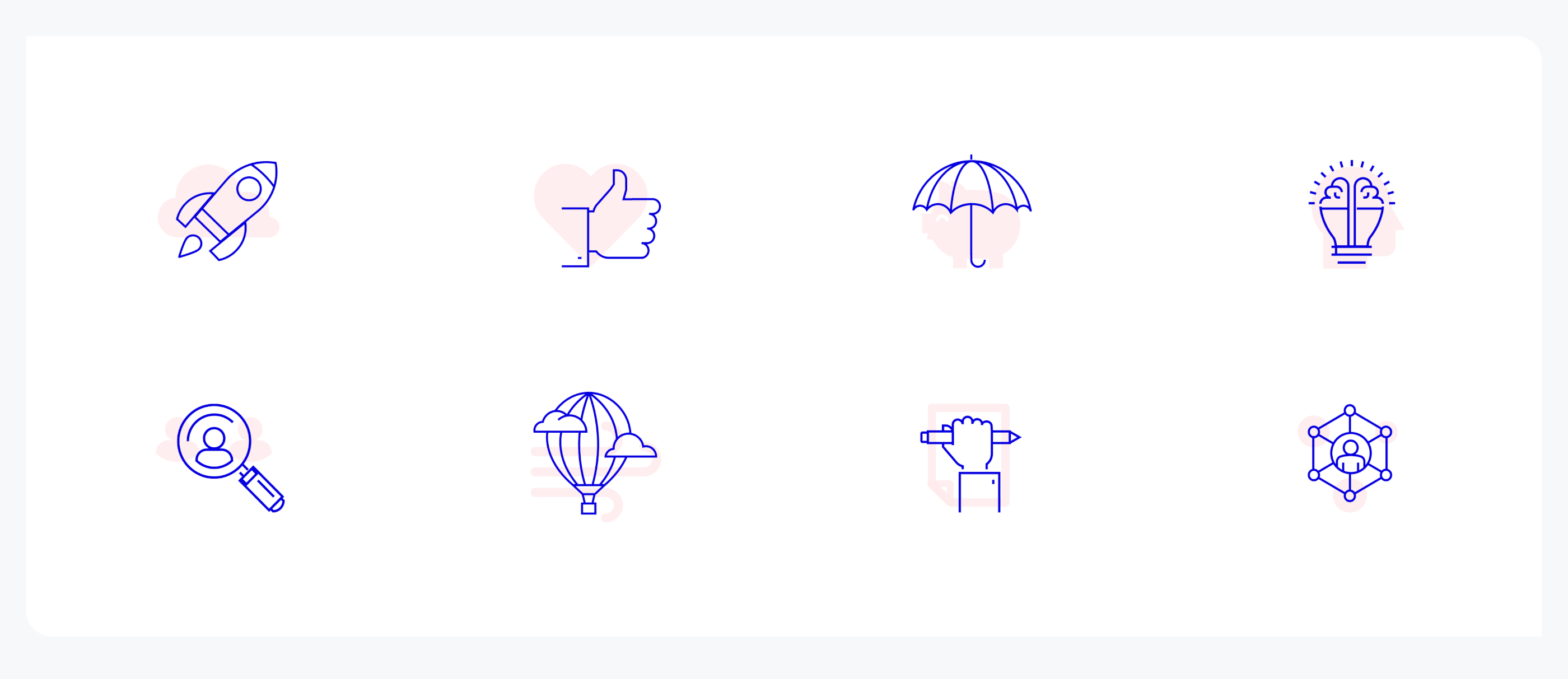
Icons
Custom made two color icons made for both versions of the website