Portal PRO is a modern and transparent platform designed for handymen all around Lithuania and operating based on sharing economy principles. It allows customers to find qualified repair services and the most suitable handyman to treat household items. While handymen can find a variety of job offers and plan their working time and workload.The platform also seeks to encourage both experienced and entry-level handymen to create a transparent and socially responsible business environment.
The client got in touch with us with a request to create the UX design for their service-based app. We have received a brief from the client about the service and the main actions to be taken in the app development. We worked closely throughout the app creation process and had regular meetings with the client to discuss the progress and further steps. The agile UX design process consisted of three main phases and involved the research and review of personas, internal testing, wireframe, low and high-fidelity prototypes, user testing, and design.
Research & personas
The research was based on competitive analysis and identified a baseline for what potential users might expect from the service-based app. We’ve learned that the user base consists of professionals with different work experience, as well as age groups. What is more, some users might use the app as the main source of income, and some only as a part-time option.
John Brooks
Age: 37
Information:
John has been working as a handyman for a while now. He thinks it could be a great opportunity to work on the app as a full-time job. He has professional experience and understands how to use a platform.
Goals:
Earn money and have the flexibility to plan his time and workload.
Needs:
Improve professional skills to get higher rates and promote his services efficiently within the platform.
Frustrations:
Get fewer orders and not make full use of his time or lose money.
Tim Allen
Age: 52
Information:
Tim has a lot of professional experience. However, he is not familiar with similar applications and is not fully confident using the platform.
Goals:
Earn an extra income while being retired.
Needs:
Get more information about how to use the platform (the bidding system, payment) and make sure he gets paid and his salary is secured.
Frustrations:
Not to get any requests, not to get paid, lose time and money.
Creating user flows
If there is ever an apparent time and place to create a user flow, it is when you are faced with designing a simple-to-use application, related to subject matter that you are not completely familiar with. It is also essential as it forms the basis for further steps in the UX design.
Low-Fiwireframes
User Onboarding
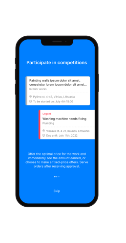
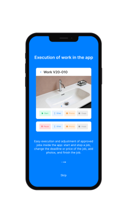
The onboarding process has lasting benefits for both customers and business. It makes it easier to order and provide services. The information users need to order or provide a service is readily accessible. It creates a smooth process, and builds a feeling of trust.
Mobile app icon
The Portal PRO icon represents a brand image and app’s function. The three-letter icon is recognizable and easy to identify.
All the current work orders
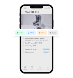
The platform users can see all the current work orders. Internal order screen shows photos attached by the client, detailed task description, deadline, and approximate address. Users can also contact the client directly for more details.
There are three types of orders: simple (when the users make a bid and Portal PRO system filters the most optimal price for the client); fixed (when the price is already indicated by the client and the user can just accept the order); and urgent (when a user can accept to take on an urgent task).
Easy scheduling
To make the process as easy as possible, the Portal PRO app has a calendar where users can plan and coordinate their schedules. This feature allows users to see what tasks need to be done and when. Ultimately, it helps users stay organized and manage availability – especially when the workload is bigger.
Adding start and end time of the task
Once the order has been confirmed, the users can see the exact address of the client. Upon a requested date, the user can access a map to go to an object. They also have to add a start time and an end time for the task. In case there is a necessity to leave an object to go to the shop for missing material, or take a lunch break, the user can also hold task time on the app.
Once the work is completed, the handyman has to attach the photos of a repaired object and leave a comment for the client about what was done.
All invoices in one place
The app allows users to see all their invoices in one place. Each invoice has clear information on the date, contact details, address, type of work done, amount to be paid, and other relevant details.
Get in-app notifications
The app users can get notifications about new features, and confirmed or canceled orders. Portal PRO also collects users’ professional certifications, so in case the certificate expires, the users also get a notification about it.